from my GDL blog on b-prisma.de from 0.06.2014:
The topic of user interface in GDL objects has been occupying me very strongly since its introduction in ArchiCAD 6.5.
In my own objects, I always try to create a user interface that is as easy to use and intuitive as possible.
Creating the user interface can be very time-consuming, especially when working with many graphical elements. However, it is also possible to build a smooth user interface without many graphical elements, and the effort involved is manageable.
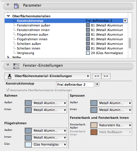
I personally, and many colleagues I'm in contact with, find that dual parameter management, i.e., each parameter being listed in both the parameter list and the user interface, is rather misleading and counterproductive and should be avoided (see Image 1).
In my own objects, I therefore try as much as possible to dispense with parameters in the parameter list entirely and accommodate all parameters in the user interface. Sometimes I make the following exception: parameters for list evaluations or FM parameters are only available in the parameter list and not in the user interface; there is never any duplication.
What should definitely be avoided is having both parameters that exist in the parameter list and user interface as well as parameters that are only available in one of the two settings dialogs; this is sometimes the case with Graphisoft objects and can sometimes lead to tedious searching.
An exception is room stamps: here it is sometimes necessary to keep parameters in the parameter list set to "visible" even though they already appear in the user interface; otherwise these parameters cannot be listed; I assume this is due to a bug. Therefore, I put all setting parameters of a room stamp into the user interface.
In the following, I would like to provide guidance on how to plan a clean and organized user interface from my perspective and create it relatively quickly:
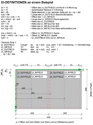
- Work with variables for all UI coordinate values instead of numerical values; this is somewhat time-consuming at first, but once you have created a system, you can reuse it repeatedly, and you work much faster when copying script snippets and making changes to the user interface.
- You should think of a grid. I usually work with 2 x 2 columns, i.e., one column of infields, 1 column of outfields and the whole thing again next to it. I divide the columns so that as much content as possible fits lengthwise in the outfields. The infields often don't need to be quite as long. Then I divide the variables mentioned in point 1 so that they control my planned grid.
- Even if some fields are too long, it still looks better to stick to the grid than to adjust all fields exactly to requirements.
- Behind each row there is a "line break" in which the y value of the rows is incremented, e.g., y_value = y_value + line_spacing. Subsequently, you can use the variable "line_spacing" to control all line spacings on a page if it becomes too tight at the bottom or if the visual image can benefit from more "breathing room".
- The X variables of the 3rd and 4th columns, which control the X position of the fields, have almost the same variable names as the corresponding variables of the 1st and 2nd columns. For example, dux (starting value 1st column), dix (starting value 2nd column), ddux and ddix 3rd and 4th columns. This way, if needed, I can simply duplicate a block from the left column and add a d in front, so that the duplicate automatically takes up the right 2 columns.
Image 2 shows an example of how you can basically build a user interface; whether you can always work in 2 columns depends on taste and situation, but it is definitely possible space-wise (even if not always).